Overview
This project aimed to streamline appointment scheduling. A side project of sorts, exploring how the process of appointment scheduling could be simplified and improved for both business owners and customers seeking services.
Simplifying the Online Booking Proccess for Businesses and Individuals
This project aimed to streamline appointment scheduling. A side project of sorts, exploring how the process of appointment scheduling could be simplified and improved for both business owners and customers seeking services.
Product Designer
- Research
- Design
- Prototyping
Product Designer
Tech Lead
4 months
Based on our initial discussions we agreed on taking a fairly lean approach. The idea was to streamline development as much as possible and ensure agile style communication was conducted on a regular cadence. The key phases that were applied are shown below:

The discovery phase focused on understanding the competior market and establishing the brand identity, business objectives, and user needs. This phase included:
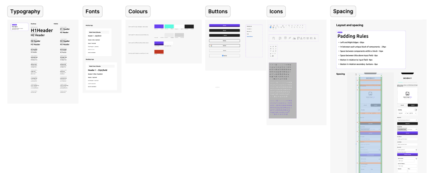
In the top screen I defined design token system that formed the foundation of the product’s visual language. This included consistent rules for typography, colour usage, button styles, iconography, and spacing. By establishing these tokens early, I ensured visual consistency and efficient scalability across mobile and desktop designs.
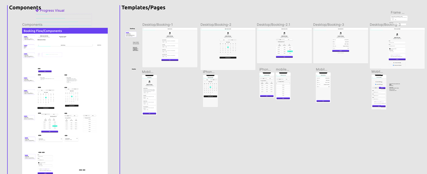
Beneath this, I structured the design screens into two main sections: components and page templates. The component panel on the left houses all reusable UI elements—such as input fields, date selectors, time pickers, and progress visuals—organised by interaction stage. On the right, I arranged full-screen templates in a linear sequence, showing both desktop and mobile flows from service selection through to booking confirmation. This setup ensures a clean design-to-development handoff while supporting rapid iteration and a cohesive user experience.
The high-fidelity designs for the Bookii mobile app illustrate a clean, intuitive onboarding flow tailored for small business owners and solo service providers. From login to business setup, the interface balances visual simplicity with functional clarity. The use of bold typography, consistent iconography, and a vibrant purple accent creates a strong brand presence while maintaining usability. Key screens include user authentication, service category selection, business profile creation, service input, availability scheduling, and shareable booking link generation. Each screen follows mobile UI best practices, ensuring quick setup, minimal cognitive load, and a smooth progression for users aiming to get their booking link live with minimal friction.
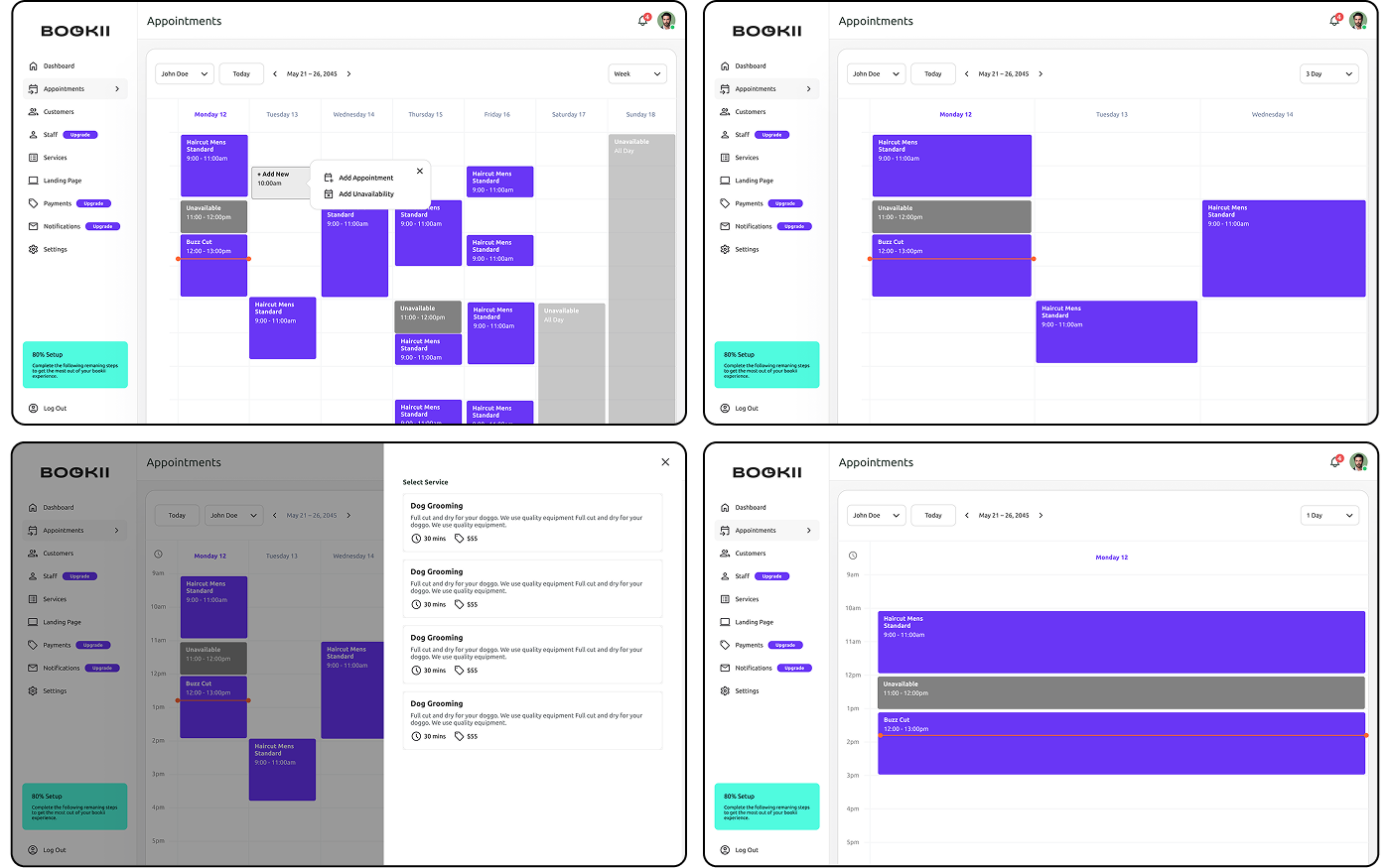
The calendar interface in Bookii’s desktop dashboard demonstrates a clear, functional approach to appointment and availability management. Users can toggle between daily, 3-day, and weekly views, offering flexible scheduling perspectives for service providers. Appointments are visually distinguished by colour and label, while blocked-out times for unavailability ensure clear time boundaries. The design supports quick actions such as adding appointments or marking unavailability via a floating modal. A service selection panel allows users to choose from predefined service templates with key metadata such as duration, category, and price. With a clean layout, minimal distractions, and a sidebar for fast navigation, this section of the app supports efficient booking oversight while remaining approachable for users managing high volumes of appointments.
The booking flow for customers showcases a seamless and user-friendly experience from service selection to confirmation. Beginning with a branded services page, users are guided through an intuitive process to choose their desired service, date, and time. The split between calendar view and time-of-day filters improves usability, offering flexibility based on availability. Each step maintains clarity through progressive disclosure, allowing users to confirm their selections before submitting details. Login options via Google or Facebook simplify authentication, while manual form fields remain accessible. Upon completion, users receive a clear summary and confirmation screen with calendar integration options, supporting both convenience and reliability. The consistent layout, purposeful use of white space, and accessible language reinforce Bookii’s value proposition of “Booking Made Simple.”
The final prototype video showcases the full desktop booking journey, with a focus on demonstrating the interaction flow and user feedback through distinct UI states. Key interaction points—such as loading animations, confirmation messages, and state transitions—are intentionally designed to illustrate the rhythm and responsiveness of the experience. These subtle but crucial details help communicate the feel of the product to developers, ensuring a smooth handoff from design to development. At the same time, they serve an important UX function by providing clear feedback to users at each stage of the booking process, reinforcing trust and reducing uncertainty during critical actions like submitting a form or confirming a reservation.
The importance of interaction feedback
Throughout the design process, I came to deeply appreciate the importance of interaction feedback in creating a seamless and trustworthy user experience. Small yet intentional design details—like loading spinners, success messages, and button state changes—play a critical role in communicating system status and reducing user uncertainty. These feedback mechanisms not only guide users through tasks but also build confidence that their actions are being registered and completed. By designing for clear and timely interaction feedback, I was able to enhance usability and support a smoother, more intuitive booking experience.
Simplifying the booking proccess: A Collaborative Side Project aimed at Professional Individuals and Small Businesses