Overview
EHPlabs is a global health and fitness supplements brand known for its range of products aimed at enhancing athletic performance, weight management, and general well-being.
The overarching goal of this project was a complete website redesign for EHPlabs, with one of the key features being a product bundles page. My role was to lead out the design proccess, which included the ideation of solutions, proactive communication with our client, and implementation of the designs in Figma.
The Proccess
The design process for the UX and UI of the product bundling page was carefully crafted with both user needs and business objectives in mind. Initially, research was conducted to understand the motivations behind users seeking bundled products, such as convenience, value, and ease of purchasing complementary items together. Wireframes and prototypes were created to explore various layouts that would simplify the bundling process and provide a fluid experience from browsing to checkout. The aim was to create a design that was intuitive and user-friendly, allowing users to quickly select and customise their product bundles.
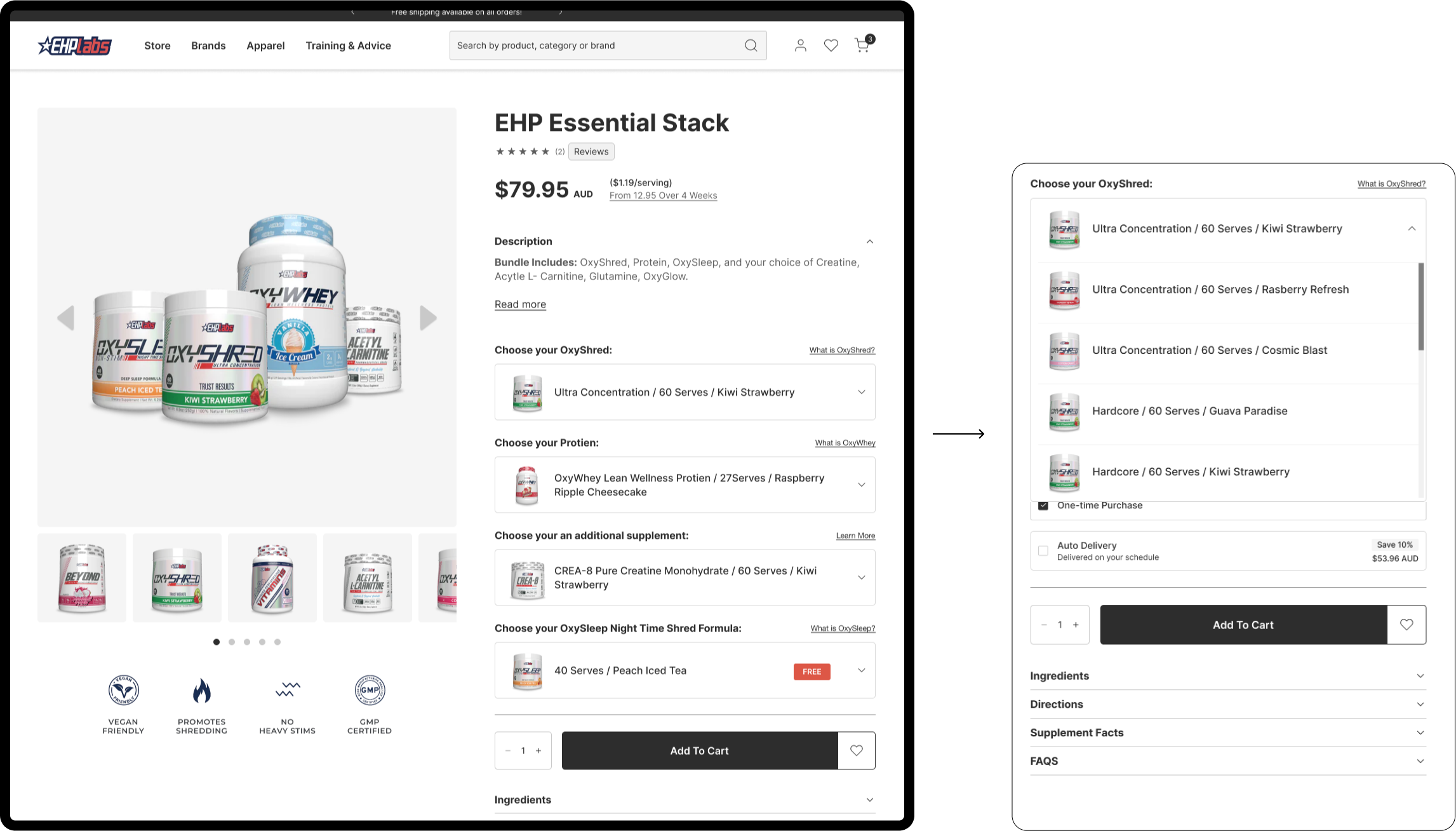
The interface incorporated thumbnail imagery for each product option, purposefully chosen to enhance quick product recognition. This allowed users to immediately identify and compare products visually, speeding up the decision-making process. Furthermore, product options were condensed into dropdown menus on the desktop version to avoid overwhelming users with too many visible choices. This streamlined approach provided a clean, organised interface while maintaining accessibility to all available options.
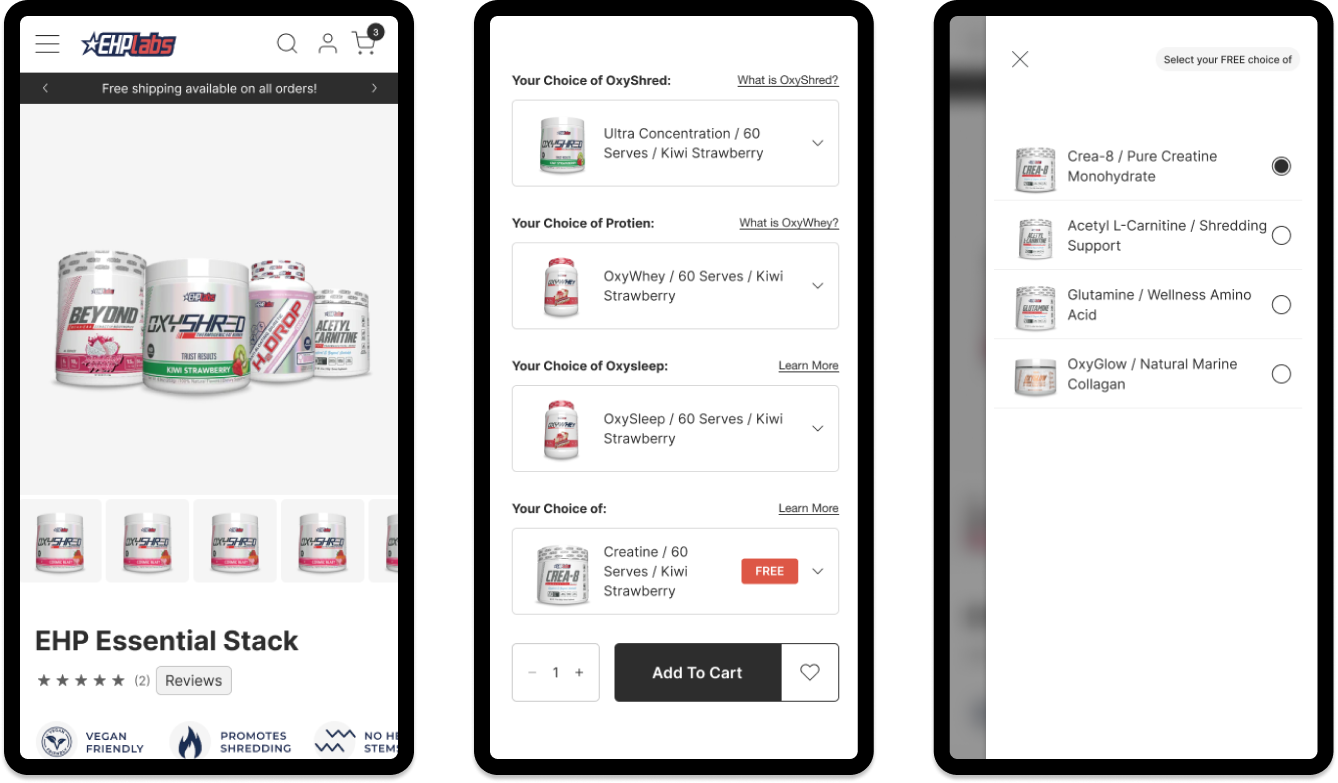
On the mobile version, a slide-out modal was intentionally employed to list product options, replacing the dropdown menus used on the desktop. This decision was made to optimise the mobile experience, where space is limited, and dropdowns could feel cumbersome. The slide-out modal offered a more efficient way for users to explore and select products without disrupting their browsing flow. Through iterative testing, the design was refined to ensure it provided an optimal experience across all devices, balancing ease of use with aesthetic appeal.
The Result
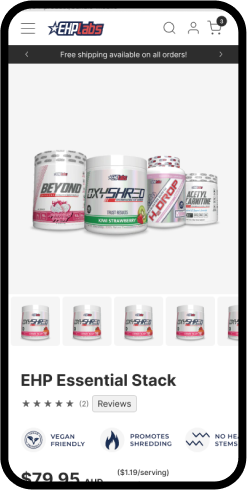
The design process for the product bundling page resulted in a thoughtful, streamlined experience across both mobile and desktop platforms, as illustrated in the screenshots. On desktop, the bundling page displays product options using dropdown menus, offering a condensed, clean interface that reduces cognitive load while allowing users to select their preferred products without overwhelming them with too many options at once. This approach ensures that all available choices are accessible, yet neatly organised, preventing visual clutter. Thumbnail imagery is employed effectively in each dropdown menu, helping users quickly recognise products based on their visual familiarity. This visual aid speeds up decision-making, ensuring users can efficiently compare and select their preferred product variants.
On the mobile version, the design adopted a slide-out modal for product selections rather than dropdowns. This design decision was made to optimise the mobile interface, where space is more limited. Dropdowns on mobile can sometimes feel cramped and hard to navigate, but the slide-out modal provides a cleaner, more intuitive experience by allowing users to scroll through product options in an organised list without leaving the main page. This design choice enhances usability by ensuring that users can focus on their selections without feeling overwhelmed or losing context within the page. In both versions, the visual hierarchy and use of consistent, recognisable imagery create a cohesive experience, making the bundling process straightforward and user-friendly.
The Impact
The impact of this design approach significantly improved the user experience by streamlining the bundling process, increasing engagement, and reducing friction during product selection. By incorporating thumbnail imagery, users were able to quickly identify products, which sped up decision-making and enhanced their overall satisfaction. The use of dropdowns on desktop kept the interface clean and organised, while the slide-out modal on mobile ensured a smooth, intuitive navigation that catered to smaller screen sizes. This attention to detail across devices led to a more seamless user journey, likely contributing to higher conversion rates and increased customer satisfaction.