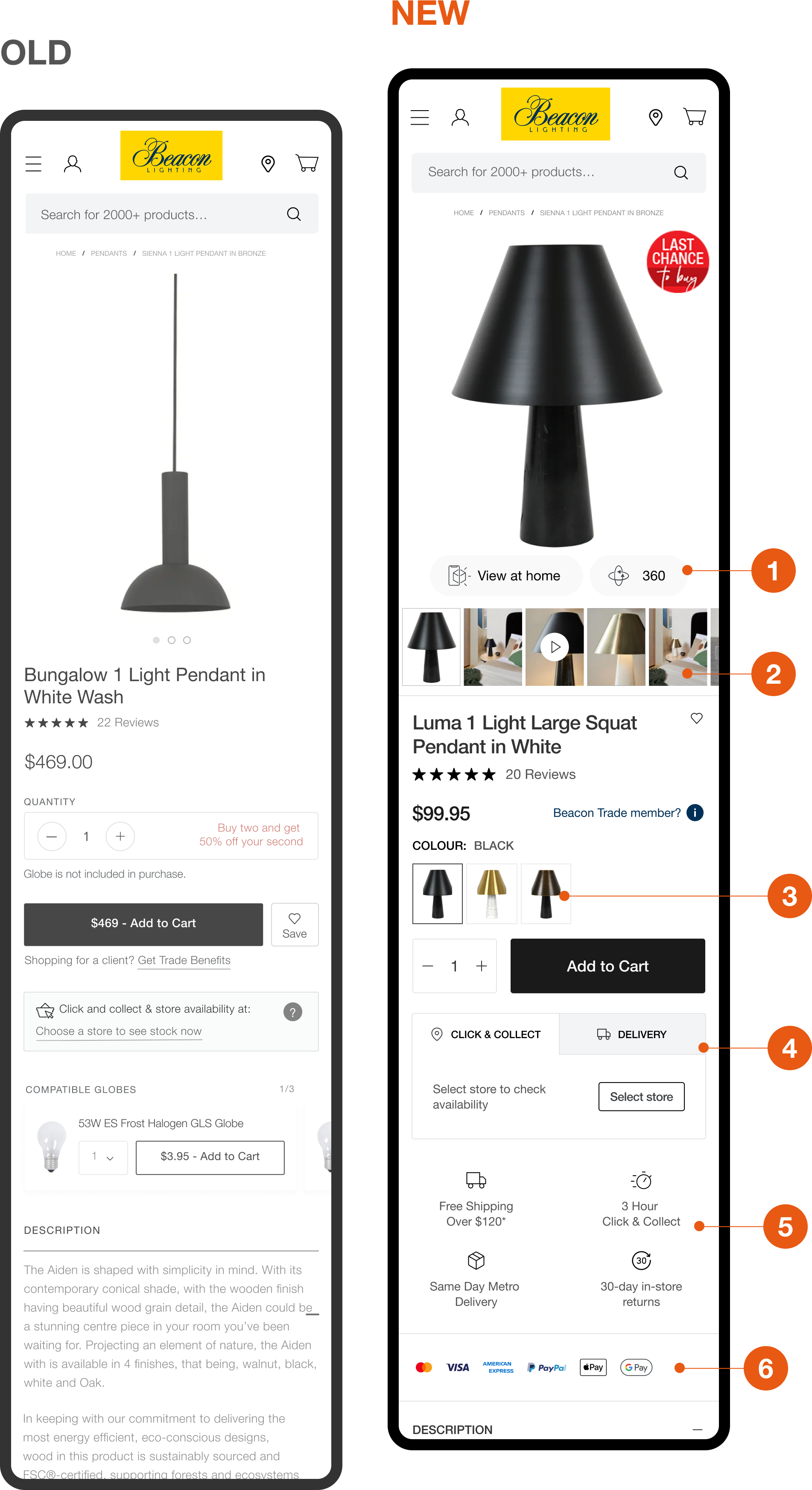
Beacon Lighting

Optimising Beacon's Shopping Journey by Revamping Product and Category Pages with Improved UX and UI

UX/UI DESIGNConversion Rate OptimisationEcommerce

Overview

Beacon Lighting is Australia'a largest lighting retailer that offers a wide range of lighting fixtures, ceiling fans, and accessories for residential and commercial spaces.

As the Lead Digital Designer, I spearheaded a frontend analysis of the Beacon Lighting website to enhance the overall browsing and purchase experience. Additionally, I effectively communicated design decisions to key stakeholders and crafted vibrant UI solutions to bring these enhancements to life.

My Role

Design Lead

- Research & Exploration

- Stakeholder Management

- Development Handover

Team

Digital Designer

Project Manager

Tech Lead

Duration

2 months

Product Page Improvements

1. View at home and 360 degree CTA's

Enable immediate access to unique functions that provide a more immersive experience of the product

2. Product Image Slider

Image thumbnails proivde increased engagement and a clearer perspective on the collection product images available to view.

3. Produt Image Variants

Thumbnail variants provide users with a better visual of the colours available.

4. Click & Collect and Delivery Options

Pick up and delivery options clearly displayed, an important component to users shopping online.

5. USP's

Unique selling points are positioned near the add to cart for allowing for instant regognition.

6. Payment Icons

Payment icons act as trust signals that enable user to instanly recognise the availability of well-known payment providers.

The category page was another screen where we provided frontend analysis to help improve the proccess of product discovery on the site. The original version of the category page contained a lifestyle banner that dominated the bulk of the screen above the fold on mobile and desktop devices. Products and sub categories were not easily visible on page load and forced users to scroll down the page. With Beacon being a company that sell design focused lighting products, we looked at levereging the customers natural value for asethetics. How we achieved this was by putting an emphasis on visual navigation.

Category Page Improvements

Visual Category Thumbnails

With Beacon being a brand that is very much driven by aesthetics and interior design, I recommended and designed a subcategory thumbnail carousel. The inention: to proivde users with a better ability to instantly recognise product types and style. Therefore having a more streamlined browsing experience that requires less cognitive load.

Product or Lifestyle Image Toggle

This function already existed. However it was placed in a at the bottom of the left side filters. Easy to miss, and not easy to understand. Heatmaps revealed little engagement and although the function was useful it was difficult to understand at first glance. In order to understand this tool users would have to interact with the element and thus discover the funciton from there. In other words it was not intuitive. To address this, I repositioned the selector, in a more prominent position and redesigned it as a toggle switch with thumbnail imagery to better illustrate the inention of the function to Beacon's customers.

The Result

An improved product discovery and CRO driven PDP purchase experience. By reevaluating the Beacon Lighting websites frontend with a CRO and usability lense. We were able to produce a more intuitive experience that levereged the websites existing functionality. This project was less about creating new features, but more about putting an emphasis on Beacon's user experience - harnessing the power of best practice and intentional UI design.


More Projects